Tuesday, November 30, 2010
Yearbook 11/30
Multimedia 11/30
After that, you may work on your final project for this class. It should take you the majority of the last couple weeks of the semester. We will discuss it in class. If you have any confusions regarding it, let me know and I will explain in greater detail.


Monday, November 29, 2010
Yearbook 11/25
Thursday, November 25, 2010
Multimedia 11/25
Most of December will work a little differently than majority of this semester. However, before we go into that, I would like you to try out Adobe Illustrator. It is in some ways very similar to Photoshop, but in some ways very different.
There is a very important difference you need to understand. Majority of what Photoshop creates is pixel or bitmapped based images. Illustrator, on the other hand, was designed to create vector based images. Pixel vs vector; what does that mean? I'll leave that up to you to find out. Look it up and let me know what you find in your blog.
Use today to try out a few of of the following Adobe Illustrator Tutorials.
- Creative Lettering
Tuesday, November 23, 2010
Yearbook 11/23
Sunday, November 21, 2010
Multimedia 11/21

From a notorious radio news broadcast in 1938
Peace Corp Advertisement
Advertisement for Decreasing Oil Usage/Carbon Cap
Friday, November 19, 2010
Multimedia 11/19
Thursday, November 18, 2010
Yearbook 11/18
Tuesday, November 16, 2010
Multimedia 11/16
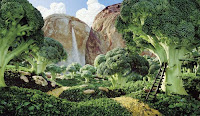
File: Food Template
Using table styles, fonts, colors, and etc can really give character to your spreadsheet and reduce the generic look of the template I've created for you. Watch this short video tutorial on numbers, and then customize the template as you would like. Can you figure out how to customize your graphs as well? The document I provided only has a sheet for the first day, so you will need to duplicate the page and change the appropriate data for the second day, but customize your document first so your design style stays consistent.
Part Two
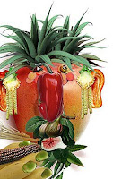
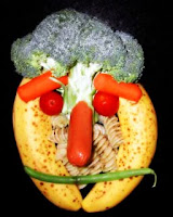
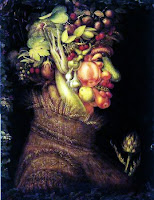
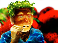
Monday, November 15, 2010
Multimedia 11/15
Thursday, November 11, 2010
Multimedia Nov 11th
Follow whats on the blog. Keep your substitute happy. Your work for today will be counted as a quiz grade. I am asking him to leave notes regarding the classes. Less-than-positive comments will result in a detention. Show the substitute how well you can work. In addition, if he decides you can't spend the class time working diligently on whats on the blog, I do have a packet you can read and write an essay on. This warning is on the blog and you were told last class, there's no excuse for not knowing. Do what is on todays blog first! You can work on stuff from the previous class next time. Spend all your time doing the best you can on today's work, nothing else will count for the quiz grade.
You have three things to work on today, get as much done as you can! Post whatever you finish, even if you're not done. Photoshop? Save it as a jpg and show me what you've done even if its not complete. Telling me you have an amazing piece of work without showing me isn't worth anything.
Typography and You!
I have three links for you to look at. Check them out, and then in your blog reflect on typography. What is it? They're just words, right? Why do you think big companies pay artists for typographic work? How might typography effect you or other potential consumers? Is graffiti, even if illegal, typography? What do you think about typography? Think about these as you watch the video and looking over the websites below, then tell me what you can about typography and reflect on your thoughts over it. (video not working? try firefox)
Typographics - Vancouver Film School (VFS) @ Yahoo! Video
TypoGRAPHIC - pay extra attention to the anatomy (use firefox), gallery, and studies sections.
Jeremy Tankard Typography - use the drop down menu on the left to view his projects.
Typographica - a site full of content on typography.


Check out Spell with Flickr.
Type something in and watch Flickr spell it out for you.
Take the html code below and drop it into a gadget on your blog! To do this, you'll have to add the html/javascript gadget and copy and paste the html code into it. You did something similar when you added the code for your avatar at the start of the year.

Anatomy of a Font
Using the links I provided you with earlier, can you identify 1-16 in the diagram? (Click the image to enlarge it). Terms: Apex, Ascender, Arm, Bowl, Counter, Crossbar, Descender, Ear, Finial, Link, Loop, Serif, Spine, Spur, Stem, Tail
Drawing with Typography!


Use your remaining time to play with the following tutorials to learn how to use the free transform tool. Use this tool to rotate, distort, and manipulate text to build an image with letter and words. I know you may not finish. Get as far as you can, and at the end of class save whatever you have so far twice, once as a psd (photoshop file) so you can finish it next class, and once as a jpg so you can upload it to your blog to show me what you've done so far.
How to use the Free Transform Tool
Photoshop Transforming
Using Transform in Photoshop
Using the type tool (just below the pen tool), try to create pictures using text. It may take quite a few layers of text to illustrate your picture. Whats quite a few? I'd say around 20-25. It might be easier to start with a photo on the background, and put a layer of white paint at 50% opacity like we did with the pen illustrations. Then you can position the text or letters on top of the image, instead of guessing the shape of what you're trying to draw. Don't forget to increase the white layer to 100% opacity at the end. When you have the type tool selected, you can change the font, size, etc in the overhead menu.
Wednesday, November 10, 2010
Yearbook Nov 11th
Class today:
Follow whats on the blog. Keep your substitute happy. Your work for today will be counted as a quiz grade. I am asking him to leave notes regarding the classes. Less-than-positive comments will result in a detention. Show the substitute how well you can work. In addition, if he decides you can't spend the class time working diligently on whats on the blog, I do have a packet you can read and write an essay on. This warning is on the blog and you were told last class, there's no excuse for not knowing.
Do what is on today's blog first! You can work on stuff from the previous class next time. Spend all your time doing the best you can on today's work, nothing else will count for the quiz grade. Post whatever you finish, even if you're not done. Work on your page? Screenshot it, crop it to just the page itself, and blur any last names/school names/locations to stay safe online and save it as a jpg so you can post it on your blog. Telling me you have an amazing piece of work without showing me isn't worth anything.
Three main things to continue working on today:
- Tri-fold (folding into three segments) 30 'greensheets' ads. Conveniently, the icons start a third of the way down the page. Start with the icon side up, fold the bottom of the page to almost conceal all four rows of icons. Then just fold the top flap down. This has priority over the other two. It must be finished TODAY!
- Sales
- Yearbook Page #2
Yearbook Sales
- Ted Presentation The Post Crisis Consumer Even if your selling to other students, some of the general trends of our current economy have likely trickled down to them through their parents. Their are some worthwhile things to keep in mind when trying to sell to them.
- Ted-Short How to Start a Movement How can you turn yearbook sells into an actual movement? Up til that point, our yearbook won't be truly successful until it reaches that saturation point. Once there, then we can really make some amazing stuff. But how do we get it there? Make every sell count, buying one yourself? Fill out the order form where other people can see you. The more they see people buying them, the more momentum we will build.
- Google is your friend; searching Bing, Google, or your search engine of choice on how to be a good salesman will provide you with some useful information as well.
- It might be a good idea to stay organized with who you've talked to and who MIGHT be buying a yearbook with your name credited to it. Might? Yes, might. Only payments received before thanksgiving count. If you get exactly five people to say they will, but only three actually do, things won't look too great for you.
- Tell me about what you did. I can only grade what you show me on the blog, so show me that you really got something out of class today. Impress me.
Your Second Yearbook Page:
Due before Thanksgiving. If you're going to be absent the week of thanksgiving, finish early or finish at home. You can access studioworks wherever you have the internet. Stay on top of things and get your page as complete as possible.
Show me whatever you got done, even if it isn't complete. Screenshot it, open it in photoshop, and crop and blur appropriately to protect yourself.
Short Classes Today
Today may be short, but don't forget your daily blog post!
Monday, November 8, 2010
Yearbook November 8th
- Type up your letter, have two other students read over it and provide feedback on how to improve it. Once complete, send me a new copy and I'll look over it for any final changes.
- Check your blog for anything unsafe. This includes any photos of you, or your full name, school, location, or any other personal information anywhere on your blog. If you didn't remove the old screenshot from the quiz when you uploaded the new one, then your blog isn't safe :(
- Start getting stuff ready for your second page. Start working with other students regarding what will go on it.
- Sales assignment complete; Five yearbook sales per person. How do you get credit for a sale? a completed yearbook order form delivered with check/cash that has your name on the blank 'Yearbook Representative ___________', found at the bottom of the sheet. Need extra credit? Sell an advertisement. It might be beneficial for you to create a 'potential sales' document to stay organized. I use the word potential intentionally, until payment and order form are submitted it doesn't count.
- Second Yearbook Page as complete as possible; photos, written content, captions, etc.
- Basic Photoshop - There are some basic touch ups you can learn in photoshop that will allow the digital artists to get photos back to you faster. Learn some of the basics so you can prep some of the files before they go to a digital artist.
Multimedia November 8th!
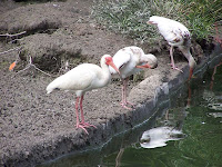
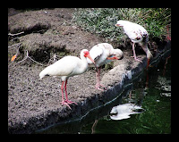

The first thing you want to get used to doing is making a copy of the background layer of your image. The Layers palette should open by default, but it is also found by clicking on Windows>Layers in the menu bar of Photoshop.
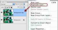
Select the Background Layer and click on the little triangle at the top right of the palette. When the palette options open, click Duplicate Layer, or you can use the shortcut keystroke, Command+J (Mac users) or Alt+J (PC users.)
By duplicating the background layer, you can make all types of adjustments to duplicate layers without permanently changing the bottom background layer. If you make some adjustments you don’t like, you can drag the duplicate layers (with all the adjustments and effects you made to them) to the trash at the bottom right of the layer palette.
2. Automatic Image Adjustments
When you start learning how to use Photoshop to improve your photos, you might want to try out some of the automatic adjustments that can be made, even if you don’t understand the tools themselves.
The basic image enhancement and adjustment tools in Photoshop are found underImage>Adjustments in the menu bar. In the Adjustment palette, there are various tools like Levels…, Auto Contrast, Curves, Brightness/Contrast.
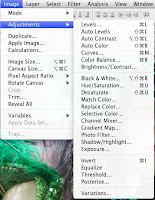
So with your background layer duplicated and selected, click on Image>Adjustments>Auto Levels in the menu bar. When you release the mouse of the menu item, the automatic Levels adjustment should enhance or at least affect the shadow (dark), midtones, and highlights (bright) areas of your image. Often, a photo can be improved in Photoshop with just the automatic adjustments applied.
3. More About Layers
Now let’s revisit how layers work. Go back to the Layers palette and click on the little eye next the Duplicate layer that you just applied the Auto Layers adjustment to. When you toggle that little eye off, it means that you’re turning off the adjustment or effect that you made in that layer. Since the adjusted layer is on top of the background layer like a clear transparency, you can toggle the eye off and on to see how the adjustments are applied to the background layer (also remember: you can drag the duplicate layer to the trash to get rid of the adjustment(s) all together).

4. Automatic Curves
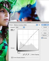
Okay, let’s return to a few other automatic adjustments and enhancements you can make to your photo. Go back to Image>Adjustments and then click on Curves. The Curves box will open. This box may look seriously scary with its grid, points, lines, and ear droppers. But don’t worry about that. We’re simply going to use some automatic adjustments to see how Curves can impact your photo.
Click on the button next to the word Preset. In the drop-down box, select Medium Contrast (RGB). If you don’t see much of a change in the contrast of your photo, go back to the Preset button and tryStrong Contrast. You should be able to see the effect of the Preset on your photo before you click OK. Curves works similar to Levels but with more intensity in contrast.
Much more could be said about Curves and Levels, but this is just an introduction. You can play around with the points in the Curves box and see how they affect your photo. Remember, the changes you make are non-destructive to your photo, so you can experiment as much as you like. The illustration below explains a little about how the three main points in the grid function. If you make a mess of things, simply click Cancel and start over, or click OK when you’re satisfied with how the photo is looking.

5. Make Colors Pop
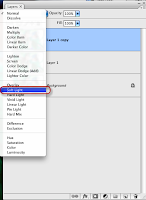
Okay, now lets move on to learn about other enhancements that can be made. One of the tools I use on nearly all the images I bring into Photoshop is one called Soft Light. Here’s how it works.
Go back to the Layers Palette, drag all the layers, except the background layer to the trash. Click on the Background layer and create another duplicate of it. Now click on the Normal button at the top of the Layers Palette. In the drop-down box, select Soft Light. When selecting this adjustment, it should make the colors of your image pop, or at least intensify the contrast of your images. The contrast of most digital images always need to be improved. This technique does that job extremely well without too much loss to detail.
If the Softlight application is too strong, select the Opacity button at the top of the Layers Palette and decrease the opacity of the layer/effect.

6. Black-And-White Conversion
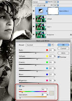
One easy and popular tool you want to know about in Photoshop is how to make a black-and-white conversion of an image. There are entire books written about black-and-white or monochrome conversion using Photoshop, but I‘m going to show you a quick, down and dirty way to do it.
Again, duplicate the background layer, and this time click on the little black/white circle at the bottom of the Layers Palette. When the drop-down box opens, select Black & White. The adjustment box will open and you should automatically get a preview of the black-and-white conversion of your image.
Again, you can play around with the settings, but the one I suggest is clicking the Tint box and then moving the Saturation slider all the way to left and then moving it back a little towards the right. When you select the Tint box, you might get a sepia effect on the image, so just desaturate the sepia effect until it looks okay to you. After you click OK, you’ll now have your black-and-white conversion.
7. Resizing & Cropping Images
Many times you’ll bring images into Photoshop and you will want to print them. Well, printing photos requires that you resize your photos to fit the size of the paper you want to print on. Say I want to print this photo on standard 8.5 by 11 paper. Well, to get the image to fit well on the photo paper, I need to change the size.
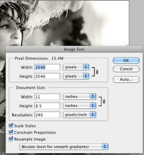
When I click on Image>Image Size in the menu bar, I can see that the original size of the photo is 15.84 by 10.5. That’s of course larger than I want. But when I try to change the numbers to 11 by 8.5, the proportional sizes don’t quite fit. So what I need to do is crop the photo for the size I need.
To do this, click on the Crop tool in the Tools Palette. It should be open by default, but you call also open it by going to Windows>Tools.
 Now drag your cursor over the image. The resulting crop box should only allow you to stretch it to 11 x 8.5 inches. You can move the crop box around to get the framing and crop you want.
8. Image Border
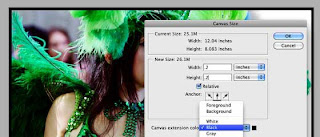
Another tool that beginning Photoshop users might want to know is how to add a border around an image. Again there are a few ways to do this. One way is to select the top layer in the Layers palette. Next click on Image>Canvas Size. In the dialogue box that opens up, change the Width and Height to both to .2. Choose a color for your border. Make sure the center of the Anchor box is selected. Click OK and you should see a border around the image.
9. Saving For The Web
One of the biggest issues with digital images is that many people don’t know how to resize photos for emailing and web posting purposes. How many times have you clicked on an image or received one or several in an email and they were too large for good viewing? Photoshop comes with a Save for Web feature that helps you resize photos.
First off you can click on Image>Image Size in the menu bar to view and resize an open image in Photoshop. You can either change the pixel dimension or document size of the image for the size you need. For example, the average size for web posting and emailing photos is 800 x 600 pixels. This is also a good size for slide show presentations. Images should rarely be larger than 1024 x 768 pixels, because that is the typical size of largest computer monitors. If you need a particular print size, you would change the document size, making sure that the Constrain Proportions box is checked so that the image won’t get stretched on either size. You might have to use the cropping tool as explained above to get the correct size you need.
 With your image resized, you’re ready to save it for web posting. Click on Save>Save for Web posting and devices. In the resulting dialogue box you want to check the number on the bottom left of the image box, which is the current resolution size of the photo. It also gives you an idea how long will take that photo to download at its current size.
On the upper left side of the window, you can select up to four views of image, each giving you a preview of the image quality at various sizes. When the resolution size is reduced, pixels are taken away, which results in a loss of detail or sharpness in an image.


You want to reduce the size of the image to say less than 100K, but maintain good image quality. In the top box on the upper right side, click the Preset button and select PNG-24 or JPEG High. PNG format typically gives you a smaller resolution size without too much loss of quality. The Quality button on the right side of the box can also be used to lower or increase the resolution size. The presets typically work fine. Just make sure you notice if the size you choose causes the image to look slightly blurry or smudgy.
After you change the resolution size, check the size again (bottom left) to see if a good size for posting. Finally, click the Save button. Photoshop will save a copy of the image where you tell it to. It will leave the original untouched.
Finally, when you go to save a file that you have been working on, there are two things you want to consider. You can save it in the Photoshop (PSD) format which means that you will save all the adjustments you made to the image, plus the various layers that you created when making adjustments and adding effects. This means that your file is typically going to be larger than the original size you started off with. But it also mean that you can reopen the file, and the layers and edits you made will be retained so that you can make more changes or complete the job.
Another way to save a file in Photoshop is in a non-PSD format, such as JPEG or PNG. Saving a file in one of these formats means that you’re not going to retain the layers when you save. What will be saved are all the changes you made and applied to the original photo. The layers will be gone. If you didn’t make a copy of the original photo before bringing it into Photoshop and you save it as a JPEG, you will lose that original state of the photo.

So when saving a image in Photoshop, it’s best to first save it in PSD format (even while you work on it) and then click File>Save As to save it in a non-PSD format. You can always delete the PSD file when you no longer need it.
Finished? Try it again on a photo(free use or stock photo of course!) of your choosing. Don't forget your citation.
You should now have at least 4 photoshop images on your blog; two from last class, 2 from this. If you're missing some, go back and find out what (or ask).


