Illustrator Projects:
We'll need to spend part of this six weeks on design cycle. A little more than I had intended actually. Many of your projects that you turned in didn't show evidence of all four parts of the design cycle. Many of you said, in the self assessment, that you think you made a 4 on this part or a 3 on that part, but what you turned had no evidence of that section at all. In those situations, you'd have a zero for that criteria. We'll need to fix that.
Below I have a couple links to projects that looked the way I was expecting. They lumped all theirs together in one big post, but that isn't the main point. Instead, notice how each part of the design cycle is fleshed out in regard to their project.
Graphing Scientific Data
Digital Manifestation
Fix yours to make sure that all four parts of your design cycle are evident for your project.
First Photoshop Tutorial
If you try the tutorial below, and just aren't ready yet, scroll down to the bottom and you can find some basic photoshop links. If you read the text below and look at the pictures (if you click them, they get bigger), you should be able to manage. Also, feel free to ask a peer (two heads are better than one).
Yes, there's a lot of reading... I know... I know. It still took a long time to make the tutorial even with the few photos provided. We used it last year too, and the students were pretty successful without too much trouble. Ask a peer or me for help if you need it.
First Photoshop Tutorial
Freeform Pen Tool Tutorial
First, find a photo you have permission to use (like from a free stock photography site) that you'd like to make into a pen illustration (don't forget to cite it in your blog entry). I found this picture of a dog on my favorite stock photo site.
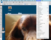
After saving it to your desktop, right click on it and tell it to open in photoshop. There are a few windows that are really helpful to have open. I don't know why this version of photoshop doesn't have them as default, but it doesn't. So, in the overhead menu, click window, and then make sure that adjustments, color, history, layers, and navigator all have checks next to them. If any of them don't, go ahead and click on them.
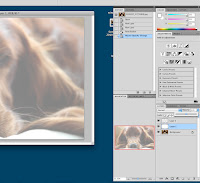
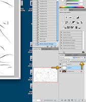
Next, in the bottom right of the layers window, tell it to create 2 new layers. Its the little icon right next to the trashcan in the bottom right of this image.
Use the paintbucket tool to paint 'layer 1' completely white. See where it says opacity in the layers windows? Change its opacity to around 50%. This will make that solid white layer translucent. Click on 'layer 2' to work on that layer so we can keep our drawing and background separate.
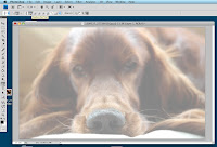
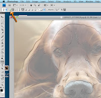
Now choose the pen tool, and the menus at the top should change. Make sure the icons at the top of your screen look like mine. This includes changing the pen into freeform mode. With the pen tool in freeform mode, you should be able to trace over parts of the image. The pen tool will still do funny things from time to time, as it will decide to smooth your lines out here and there. That's just how this tool works. Keep your fingers near command + z to undo and try again when your not happy with what the pen tool did.
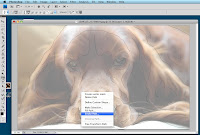
Once you've finished drawing the picture, right click and choose Stroke Path. A small window will pop up, make sure the drop down menu reads Brush and that you have Simulate Pressure checked. When you used the paint bucket tool, you had the color selector on white, if you dont change it, then pen stroke will all be in white too. note: if things turn out weird, then you probably have the brush set on too large of a size. Talk to your instructor and I'll help you.
Now the pen lines have nice strokes behind them, using whatever brush, size, and color you currently had selected. However, the pen paths are distracting as to what it really looks like. We can take care of that real quick by just changing the pen's mode. Click where the arrow on the right shows to change modes.
Now we just need to change the background to white. Switch back to the second layer and change the opacity back to 100%. Now its just you and the pen drawing. Now is the time to go in and add some color.
Create a new layer and make sure its between your white background and pen drawing (if not, drag it there). By painting on this layer, you are neither affecting the background, nor the pen lines. If you mess up, you've affected neither and can erase as needed with out affecting your pen lines or background. So select this new layer and use the brush tool to paint things as you wish. My painting was just of solid colors without any blending, but if you want to do something more complicated, it might be a good idea to create multiple layers to paint on. By doing this, you can paint different parts of your picture on different layers, not having to worry about messing up an area you already finished.
The last thing to do is save it. You can either go to file > save as, or file > save for web. What the difference? Save as will leave the image at a higher quality, but will take longer to upload into blogger, and take longer to load. By playing with save for web, you can decrease the quality to increase the speed at which it will load. When printing, you want the highest quality possible, however on the web you want lower quality images so people can actually view the image. Graphic designers normally will keep their high quality original and a smaller low quality version for faster loading. Don't forget to save your image as a jpeg, as a psd (photoshop file) won't load on your blog. Upload your image to your blog. Don't forget to cite the original.
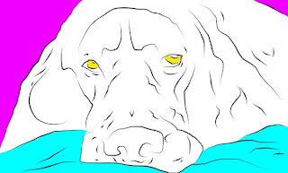
My Finished Result
Don't forget to cite your source!
(I forgot last year, and now I can't find it! Sorry!)
Try again with a photo of yourself:
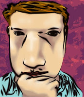
Do the same exercise, but instead of a free stock image, we'll make a cartoon of ourselves. Open Photobooth, and go into the effects (the second set to be specific), and find an interesting or amusing distortion of yourself. On some of the filters, you can adjust how much it distorts it. My distorted cartoon is on the left. It doesn't really look like me, but its amusing.
Besides, if it really looked like me, it wouldn't be too safe to put it online. After finishing the pen drawing, I just colored it. Obviously my coloring for this example is much more complicated than on the example of the dog, but yours doesn't have to be. I like my illustration of the dog just as much as my cartoon character.
To get your photo from photobooth to photoshop, you can either drag it from the selector on the bottom to your desktop (and then right click to open with), or screenshot it and then open it into photoshop. Since the original image is your own, you don't need to cite it.
Need more basic Photoshop help?


No comments:
Post a Comment