Part 1- Looking at Theme Examples
First, lets look at some examples of headers/catchphrases tying into different yearbook themes.
Choose which set of catchphrases/headings you like best, and explain why.
Now, lets look at the finished product of well-integrated theme-based yearbooks.
When you click on one of the yearbooks, you should notice that you can see roughly five 2-page spreads within their book. Go through these on both links provided above. After viewing them, choose the two you are most impressed by.
Blog about them. Which yearbook is it? Scale of 1 to 10, what would you rate it? What impresses you about them? How did they use the theme to create a well-polished final product? Any other comments?
Part 2- Try Design Once More
So, after looking over a multitude of themes from part one, hopefully you now've seen some examples of theme-based design that you like. With a bit more experience, lets give designing a layout another go.
Grab another piece of scratch paper and sketch out a two-page layout you feel strongly about for any two (2) of the following:
- Club Page
- Introductory Page
- Student Portraits Page
- Event Page (like IIW or Int'l Fest.)
- Table of Contents
Try coming up with the header or catchphrases for these pages as well.
In addition, also create a design for the cover.
Before turning that in, open Photobooth. Hold your paper up so it fills the frame (no facetime! remember to protect yourself online) and take the picture. Drag it onto your desktop. It should look something like this.
It's backward and hard to read. But we can fix that! Follow the step-by-step instructions.
Right click the file on your desktop, hover over open with, then click Adobe Photoshop. Your desktop should now look something like this -->

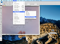
Now that you're in Photoshop... Click Image in the overhead menu, hover over Image Rotation, and then click Flip Canvas Horizontal. Now the image should no longer be backward :)
But it's still a little hard to read :/

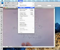
Next, click Image in the overhead menu gain, and click Auto Tone. That should take care of that :)
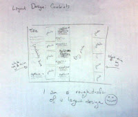
It should look similar to this now:
(but hopefully not so small)

Now, you just have to save it before you can upload it into your blog. Click on File in the overhead menu, and click on Save As... A window will pop up, don't just hit save willy-nilly. You need to change the file format from a Photoshop format into a JPEG Format. Another window will pop up, this just lets you choose the level of quality for the photo, just hit ok. Now, upload your sketch into your blog :)
Don't forget to still turn your paper in. The picture through Photobooth isn't the highest in resolution, and working with the hard copy can be easier, but if it somehow gets lost, you now have a backup on your blog too :)
Post up photos on your blog of all three designs :)
Part 3- Reviewing Captions
A few classes ago, you tried your hand at captions. Go find that caption you made, and paste it here. Follow down this checklist to see how your caption can be improved.
- First sentence of captions are written in present tense.
- Second and third sentences are written in past tense.
- The captions indicate when and where the action is taking place.
- The following words are NOT used:
- Many
- Several
- A Lot
- Success/Successful
- Dedicated
- Some
- Diligently
- Competition based activity? The captions DO NOT make reference to the future of next year's team.
- In sports captions, the outcome of the play is given.
- The caption has an attention-getting lead.
- Captions thoroughly explain the action shown in the photograph.
- Groups are identified in the following manner: Front Row: /Second Row: /Back Row:
Rewrite the caption by adapting it to meet the checklist above.


No comments:
Post a Comment